This page provides an overview of the Gamma Dose Rates Adanced Map.
The screenshots presented here may differ slightly from the actual map.
After clicking "Open the map" and acknowledging the limitations of use as listed on the Disclaimer page, the user will be able to access the advanced European gamma dose rates (GDR) map.
This action requires a cookie to be enabled in the browser. If your browser is configured to block cookies, you may have to add an exception for the Advanced Map.
The Advanced Map viewer can be accessed from any computer with an internet connection and does not require a licence or subscription.
While utilising a "responsive" design and adapting to most display resolutions, the advanced map is not meant to be used on small screen devices (i.e. smartphones) - in such case
a link is provided for the user to access the Simple Map instead.
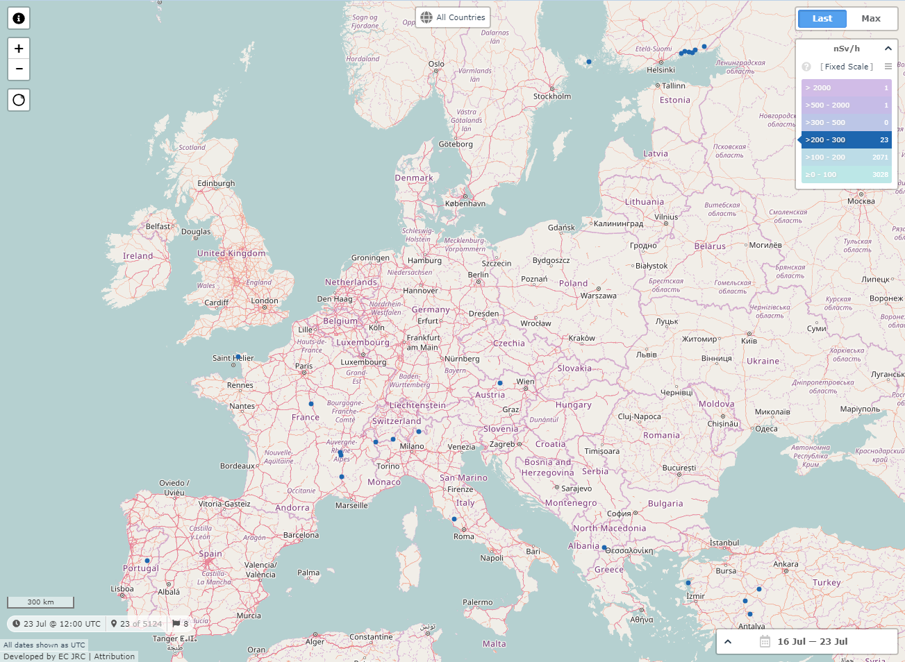
Initially, the map displays the latest Gamma Dose Rate aggregated hourly averages of the 5100 available stations, for the last 7 days.
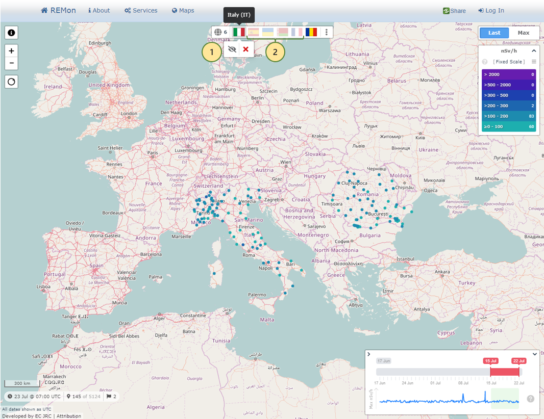
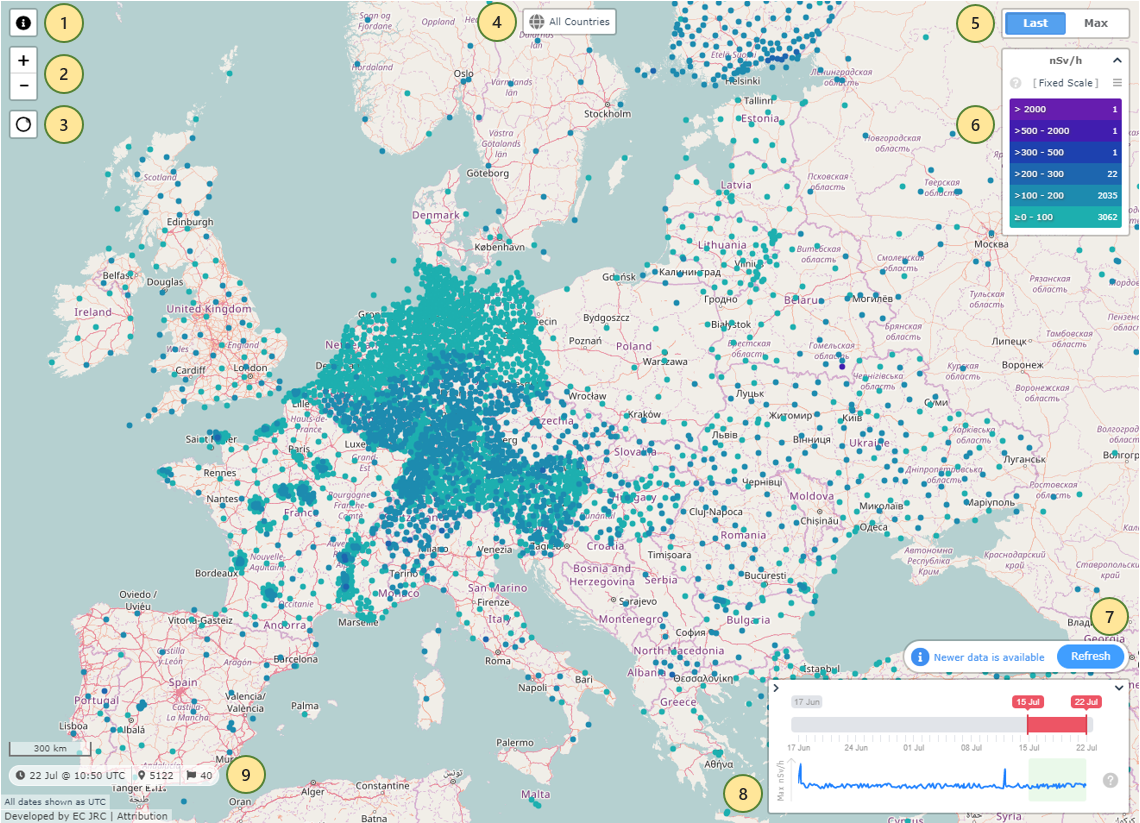 Advanced Map Overview
-
The Help button takes the user to this page, to obtain information on the key components of the Advanced Map.
-
The Zoom In/Out buttons allow the user to change the zoom level of the map. The same can be achieved by rotating the mouse scroll wheel, or using two-finger gestures on a touch-enabled device.
-
The Area Selection button allows the user to either click and drag to draw or click/tap to place a selection circle on the map.
The stations within the selected area will appear in the Selection Stations sidebar. See the Area Selection section below.
-
The Countries Filter allows restricting the stations displayed on the map to a list of specific countries. See the Countries Filter section below.
-
The top-right component permits switching between the Last and the Maximum hourly averages for the selected date range (8) to be represented on the map.
-
The Legend displays the threshold values and colors for the currently selected scale, as well as the number of stations correponding to each of the levels.
See the Legend section below.
-
Whenever new data is available since the user loaded the page or last clicked the Refresh button, a notification in this regard will appear above the Date Range.
The new data will not be automatically loaded, to not change the data displayed on the map without the user's explicit involvement.
Upon clicking the Refresh button, the new data will be included on the map.
-
The Date Range allows the user to select the date interval to be used as basis of calculation for the values displayed on the map, from one to seven days, going back 35 days at the most.
See the Date Range Selector section below.
-
The Information Pill shows the latest date corresponding to a value on the map, the number of available stations, and the number of countries currently on screen,
taking into account all the other filters. Below it is the statement reminding the user that all the dates as displayed as UTC, together with the name and version of the app, the Disclaimer link
(not represented in the screenshot above), and the Attribution link, which opens the corresponding information window.
The dots displayed on the map respresent the available stations, colour-coded according to the current Scale denoted in the Legend.
Moving the mouse over each station shows a tooltip containing the station code and the corresponding value according to the Last/Max selection and the current Date Range,
and clicking on it opens the Time Series window.
[Top]
There are many ways the user can interact with the map in order to move to and zoom in on a region of interest.
The map can be scrolled on the vertical/horizontal axes using the following options:
- Clicking and dragging on the map surface in any direction changes the view accordingly, with a nice inertia effect.
-
Using the up arrow key on the keyboard shifts the map down, the down key - up, the left key scrolls it to the right, and the right key to the left.
Holding any of the arrow keys pressed moves the map incrementally until released.
The map can be zoomed in and out using any of the methods below:
- Using the mouse scroll wheel, the map will consider the position of the mouse cursor as the focus point of the zoom in/out action.
- Double-clicking on a place on the map will increase the zoom level by one, moving the map view towards the coordinates where the click was registered.
- On touch-enabled devices, the user can use a two-fingers pinch gesture to zoom in on a specific region on the map, or to zoom out.
- The plus and minus keys on the keyboard can also be used to zoom in and out by one step.
-
Clicking and dragging on the map while having the Shift key pressed draws a zoom selection rectangle on the map, allowing the user to easily control the area of interest
to be displayed in the map view - see the image below for an example.
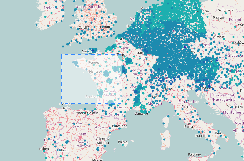 Advanced Map Zoom Selection
[Top]
Using the Area Selection button
 (see #3 in the Map Overview section), the user can then click or click and drag on the map to draw a selection circle around an area of interest.
Depending on the browser and input device, only clicking may be allowed to select an area, while clicking and dragging having the usual effect of panning the map instead.
After the user selects the desired region, the Selected Stations sidebar opens up, presenting the list of all stations in the chosen area, and two new buttons appear on the map.
The Selected Stations sidebar can show at most 500 stations. If the number of stations in the selection area is greater than this, a warning message will be displayed
and the user will have to move or resize to selection circle so that less than 500 stations are contained within it.
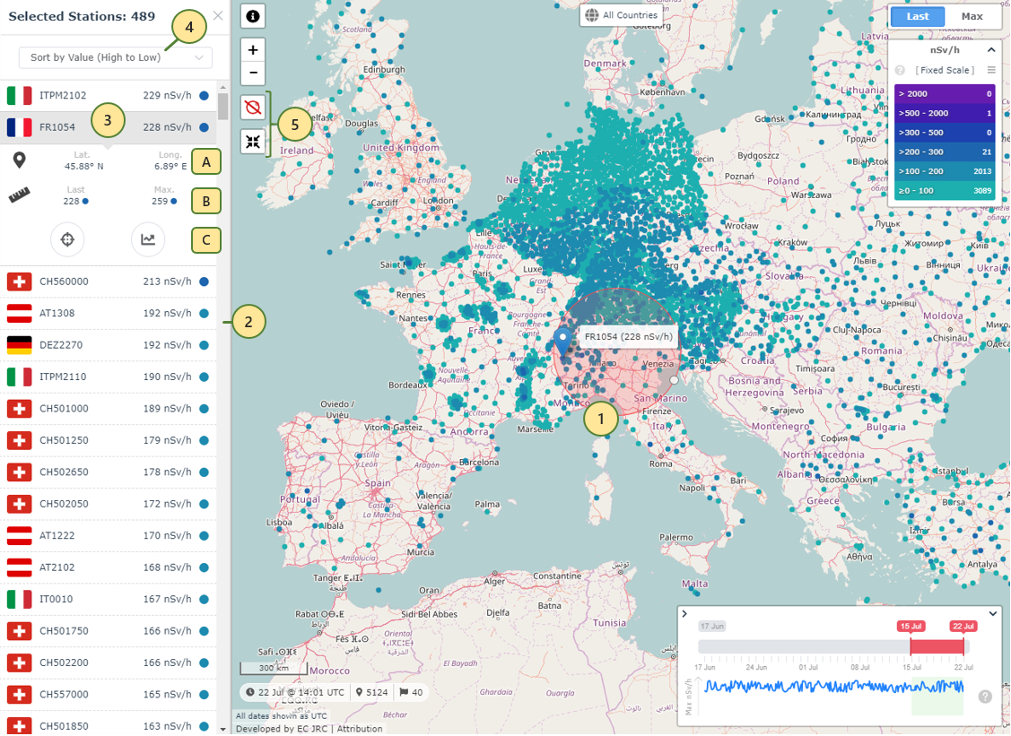 Advanced Map Area Selection
-
The Selection Circle determines the area to be loaded and displayed in the Selected Stations sidebar. The circle can be dragged freely around the map, and resized using the provided handle.
-
The Selected Stations sidebar displays the stations located within the selection circle on the map.
-
Each station in the sidebar contains the country flag, station code, as well as the hourly average and colour, according to the Last/Max selection, the current Scale and any filters.
Moving the mouse cursor over (or tapping on) any of the stations in the sidebar places a marker with a tooltip at the station's position on the map, to easily identify it.
Clicking (or tapping) on the station expands its details to provide additional information, such as the station's geolocation (A), the Last and Maximum value (B),
as well as two additional actions (C) for zooming in on the station on the map (left), or opening the associated Time Series window (right).
-
By default, the stations are ordered descending by value, the other options being ascending by value, by country, or by station code.
-
While the selection circle is on the map, the Area Selection button changes to red (top) and cancels the selection upon click.
On the bottom, the Focus on Selection button centers and zooms in the map on the selection circle.
The Area Selection functionality is not available on devices with screen size less than 992px wide.
[Top]
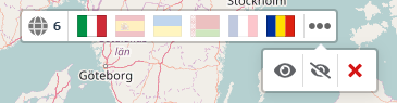
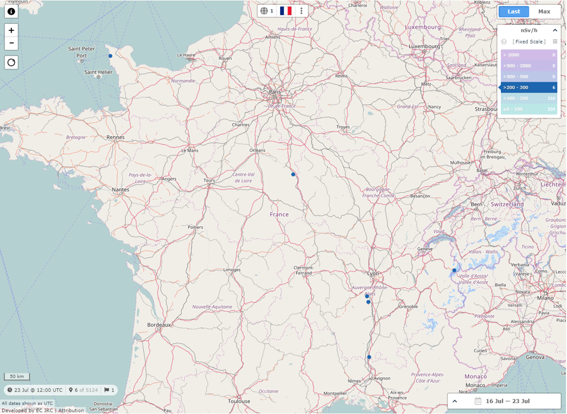
The Countries Filter allows the user to only display on the map the stations coressponding to the selected countries.
The other components of the map, such as the Information Pill, the Legend, the Selected Stations sidebar, take into account the selected countries and display their data accordingly.
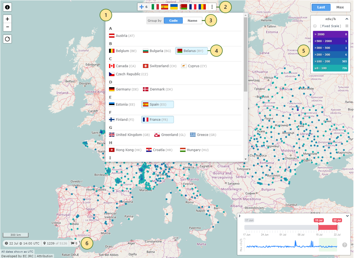 Advanced Map Countries Filter
-
The Countries Filter menu, opening when the user clicks/taps on the All Countries button
 (see #4 in the Map Overview section),
shows the list of countries reporting station data, and the user can click/tap on the ones to display on the map. If no country is selected on this menu, all the stations will be drawn on the map.
(see #4 in the Map Overview section),
shows the list of countries reporting station data, and the user can click/tap on the ones to display on the map. If no country is selected on this menu, all the stations will be drawn on the map.
-
The flags of the countries selected in the menu list appear in this bar on the map and can be interacted with. See the sub-section Selected Countries for more information.
-
The list of selectable countries can be ordered either by the international country code, or by country name, to facilitate quick identification for all the users.
-
Once a country is selected, it becomes highlighted in the menu, to clearly identify it. Subsequent clicks/taps on the country name will toggle its selected/unselected status.
-
The number of stations displayed in the Legend, as well as the dynamic scale (see the sub-section Dynamic Scales), if active,
are based only on the stations corresponding to the selected countries.
-
The Information Pill also adapts to the selected countries, and the values displayed are adjusted for the available stations.
[Top]
 Advanced Map Selected Country Actions
-
Clicking/tapping on any of the selected countries opens the actions popup, allowing to toggle the country's stations visibility on the map (left),
or remove the country from the list (right).
-
The countries toggled off are displayed faded out, and can easily be re-enabled by opening their actions popup and clicking/tapping the leftmost button.
Disabling a country, rather than removing it from the list, allows quick on/off toggling of the corresponding stations on the map, and is also reflected in the other map components,
such as the Legend and the Information Pill.
Clicking/tapping on the rigtmost button in the countries bar opens the global actions popup, allowing the user to easily Show (left), Hide (middle), or Remove (right) all the selected countries.
 Advanced Map Selected Countries Actions
The rigtmost button in the countries bar that opens the global actions popup is not available in Internet Explorer.
[Top]
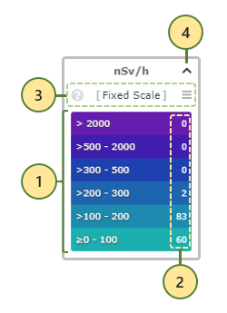
The Legend displays the thresholds and colours being used to represent the stations on the map. It also allows changing the scale in use,
as well as zooming in on the stations corresponding to one of the threshold levels.
 Advanced Map Legend
-
The thresholds correspoding to the current scale determine the colour-coding to be applied to the station dots drawn on the map.
Clicking/tapping on one of the levels filters the stations displayed to the ones corresponding to that level, and zooms and centers the map to best represent them all
on the screen - see Threshold Filter below.
-
The number of stations corresponding to each level of the current scale are displayed on the right side of that level.
-
Multiple scales are available, and this section displays the name and description
 of the current scale, and allows switching to another one - see Scale Selector below.
-
Clicking/tapping on the top-right button allows collapsing the Legend. The scale name, selector, and colours remain visible.
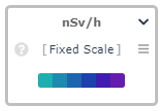 Advanced Map Legend Collapsed
[Top]
Advanced Map Legend Collapsed
[Top]
There are three different scales available, each with its own colour scheme and specific usage.
 Advanced Map Scale Selector
-
The scale name and the help icon are displayed on the left side of the menu.
-
The colour scheme preview is represented on the right side of each scale.
-
Moving the mouse cursor over (or tapping on) the help icons
opens the information tooltip, which provides a brief description for each of the available scales.
Although represented in the image above, the Statistical Scale is not available in Internet Explorer.
[Top]
While the default one - the "Fixed Scale" - is the classic EURDEP scale, with fixed thresholds and colours based on our past experience and users feedback,
two additional "dynamic" scales are provided, having the immediate advantage of being generated on the fly, based on the available data.
They react to any filters currently in use and can provide a much clearer view of the data based on the rest of the values displayed on the map.
[Top]
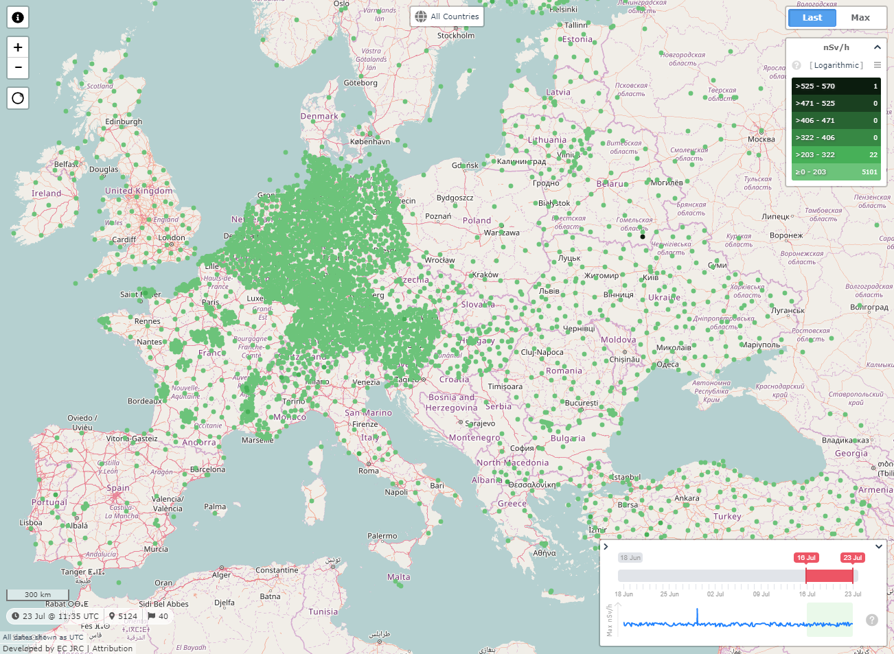
"The data values are grouped into logarithmically distributed categories driven by the low and the high of the available data.
Provides a clear representation of the top values."
The Logarithmic scale is generated based on highest and lowest values of the stations available based on any set filters, employing a logarithmic distribution of the given thresholds.
Using this scale makes it extremely easy to identify the top values displayed on the map, within the range of all the available values.
 Advanced Map Logarithmic Scale
Selecting various filters automatically adjusts the scale, providing interesting means to view the station values on the map.
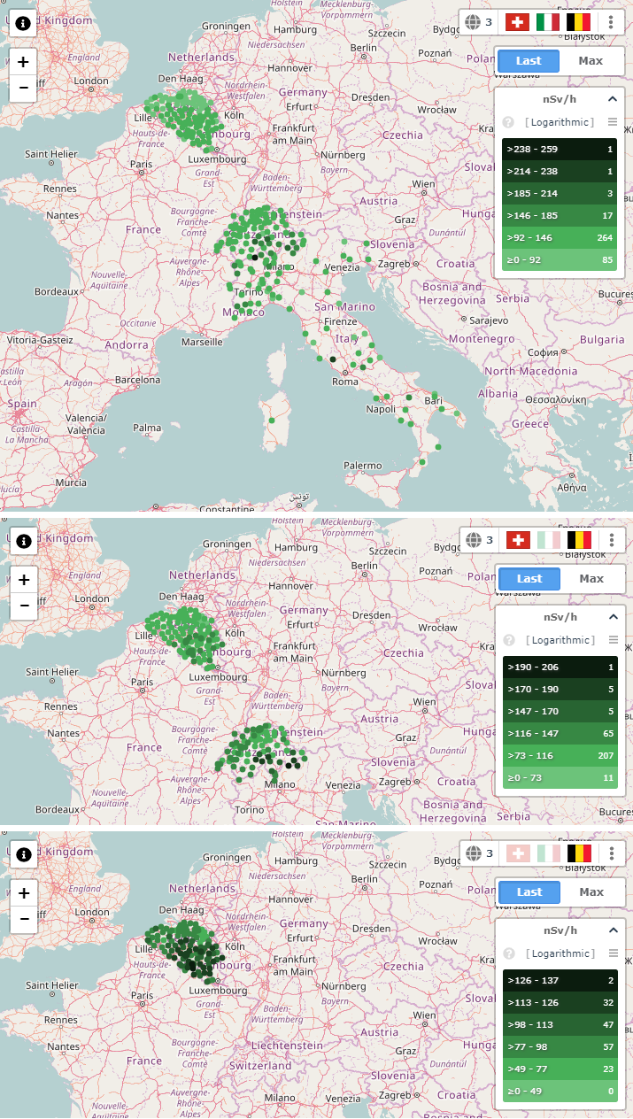 Advanced Map Logarithmic Scale Countries Filter Comparison
[Top]
Advanced Map Logarithmic Scale Countries Filter Comparison
[Top]
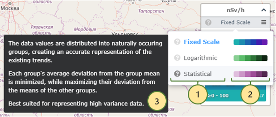
"The data values are distributed into naturally occuring groups, creating an accurate representation of the existing trends.
Each group's average deviation from the group mean is minimized, while maximizing their deviation from the means of the other groups.
Best suited for representing high variance data."
The Statistical Scale is not available in Internet Explorer.
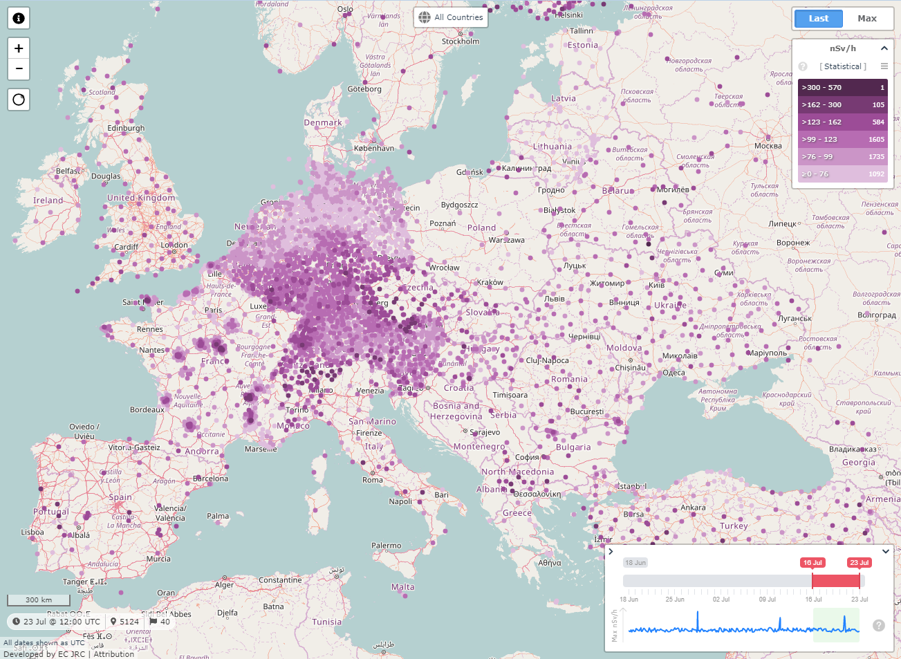
Trends in the data are best visualised using the Statistical scale, as it clearly represents the different value ranges on the map.
This scale is based on the well-known Jenks natural breaks calssification method, being one of the most used data clustering methods
designed to identify the best arrangement of values into different classes.
 Advanced Map Statistical Scale
As is the case with the Logarithmic scale, the Statistical scale is being generated based on the available data, taking into account most of the set filters.
Being auto-generated based on the data, both the Logarithmic and the Statistical scales require a minimum number of values,
depending on the steps of the scale, in order to be properly determined.
If not enough data is available because of the set filters or any other reason, a warning will be issued and none of the dynamic scales will be selectable until
enough data becomes available.
[Top]
Clicking or tapping on any of the scale thresholds hides all the stations but for the selected threshold range, zooms and centers the map on those stations,
and fades out the other thresholds in the Legend.
 Advanced Map Threshold Filter
This allows the user to easily identify the location of a number of stations corresponding to one of the scale steps on the map.
Clicking/tapping on the same threshold again cancels the filter and reverts the map zoom and/or pan to the previous bounds,
unless the map was zoomed or dragged while the threshold filter was enabled.
Modifying the selected countries while the threshold filter is active, automatically adjusts the available stations and repositions the map.
 Advanced Map Threshold Filter with Country Selected
[Top]
Advanced Map Threshold Filter with Country Selected
[Top]
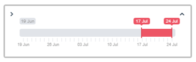
The Date Range selector allows choosing the oldest and the newest dates between which to calculate the last or maximum average values to display on the map.
All the date and/or time values displayed in this web application are expressed as UTC.
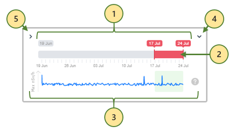 Advanced Map Date Range Selector
-
The date bar goes 35 days into the past from the present day, with marks displayed each 7 days.
-
The date range can be increased up to 7 days, or decreased up to 1 day, by moving the left or right handle, and dragged around the date bar, in order to select the preferred date span to display on the map.
-
The peaks graph shows a preview of the maximum 1-day averages over the full date bar, to make it easy to identify areas of interest within the last 35 days.
The light green area is synchronised with the currently selected date range, to provide visual feedback of the current date span on the peaks graph.
Moving the mouse over (or tapping on) the help icon shows a brief description of the peaks graph.
-
Clicking or tapping the top-right button hides the peaks graph, to give more viewing space on the map:
 Advanced Map Date Range Selector without Peaks Graph
-
Clicking or tapping the top-left button hides both the date rage and the peaks graph, leaving only the selected date range visible:
 Advanced Map Date Range Selector Minimised
[Top]
Clicking or tapping on a station on the map opens the interactive Time Series window for that station.
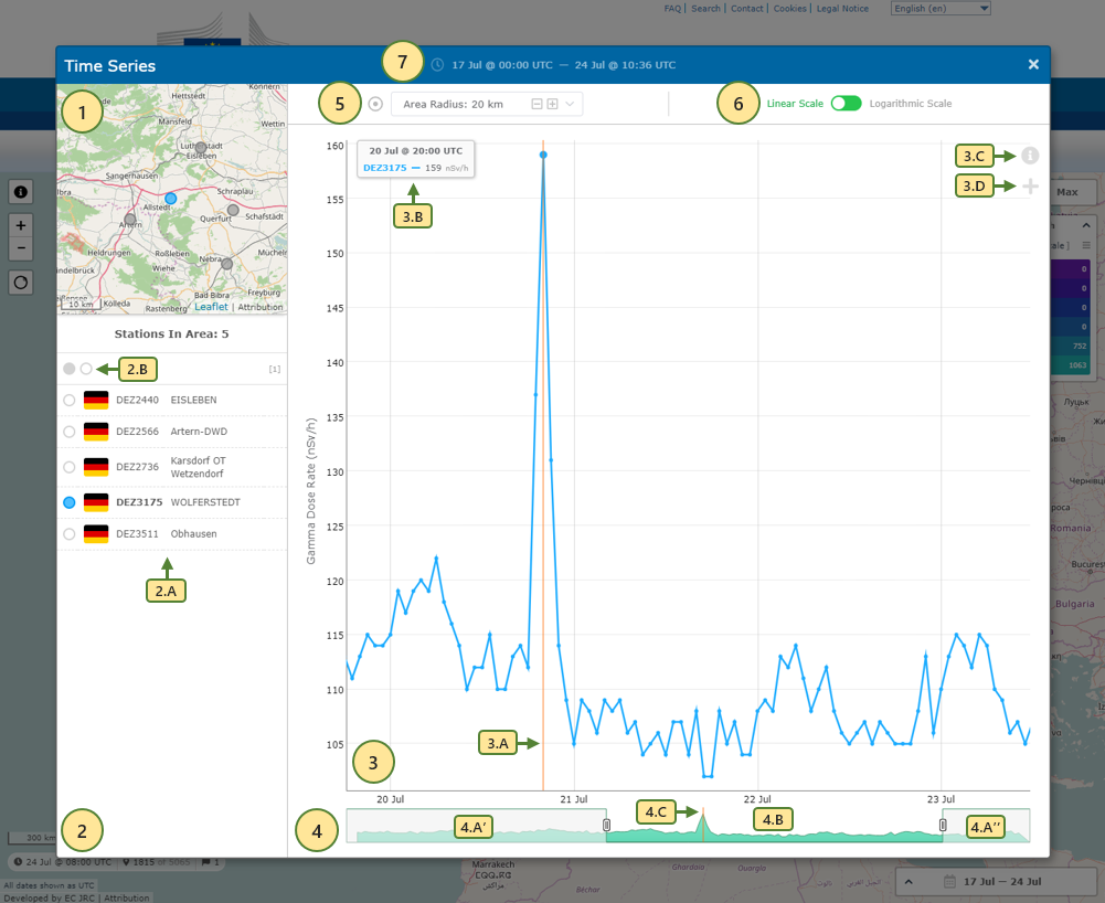 Advanced Map Interactive Time Series
-
The mini-map shows the location of all the available stations within the designated area. The blue dot represents the station selected by default,
located closest to the center of the mini-map.
-
The stations list presents all the stations available on the mini-map.
Each station (2.A) has a selection marker on the left, matching the colour on the mini-map and the colour used to plot the time series graph for that station.
The country flag is also displayed, together with the station code and name.
Clicking or tapping on another station (either in the stations list, or on the mini-map) selects it, allocates a unique colour, highlights it on the mini-map,
and adds the corresponding series to the graph.
Up to 5 stations can be selected at the same time.
Clicking or tapping the dark and light circle buttons (2.B) allows to automatically fill the remaining selection slots starting from the top of the list (dark),
or to deselect all the selected stations (light).
-
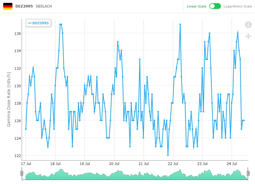
The graph displays the time series data for all the selected stations, each in its own colour. The X axis represents the time, matching the date range selected on the map,
and the Y axis corresponds to the nSv/h values of the selection station(s).
The orange vertical line (3.A) moves with the mouse cursor (or moves where tapped on the graph on a touchscreen device) and snaps to the graph points,
to help identify which data is displayed in the graph legend (3.B). The legend shows the X axis time at the top, and the Y axis values for all of the selected stations below,
together with the station codes, in their corresponding colour.
Using the "i" button (3.C), the user can access instructions on how to manipulate the graph in order to zoom in and out, or pan the view.
The "+" button (3.D) changes the vertical orange line to a cross that follows the mouse cursor on both axis, allowing quick identification of various Y-axis levels.
The "i" and "+" buttons are not available on touchscreen devices, requiring a mouse pointer to be usable.
-
The range selector displays the average graph of all the series plotted on the main graph, and also allows zooming in/out on the data,
refining the zoom level by moving the left and right handles, and scrolling left and right through the full date range of the main graph.
The greyed out area (4.A' and 4.A'') represents the part of the main graph not currently visible because of the zoom level,
while the 4.B area corresponds exactly to the main graph's view.
The orange vertical line (4.C) moves in sync with the main graph's vertical indicator, allowing precise identification of any values of interest on the smaller graph.
-
By default, the Time Series makes available for selection all the stations within a radius of 20 km around the middle point or station.
The radius can be changed here, using either the -/+ buttons, or the dropdown list, to the value of 5, 10, 20, 50, or 100 km.
If changing the radius value would display too many stations on the mini-map, a warning is presented instead, asking the user to reduce the radius value.
-
The linear scale is used by default, but, when unusually high peaks are displayed on the graph, it's reccomended to choose the logarithmic scale, in order to keep the details visible in the lower values.
-
The date/time range inherited from the map date range is displayed in the title of the Time Series window.
If the end date corresponds to the present day, the time matches the one on the map, otherwise the end of day will be used.
[Top]
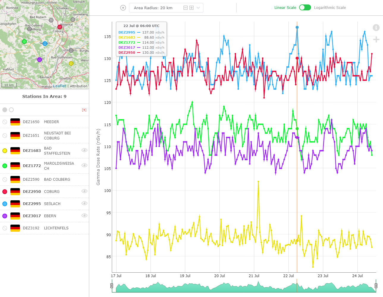 Advanced Map Interactive Time Series Multiple Selection
Up to 5 stations can be simultaneously selected on the Time Series. Each is assigned a unique colour, and all are displayed on the graph and included in the legend.
When multiple stations are selected, an "eye" button appears next to their name, allowing the user to "focus" on one station, fading out the others in the list and on the graph.
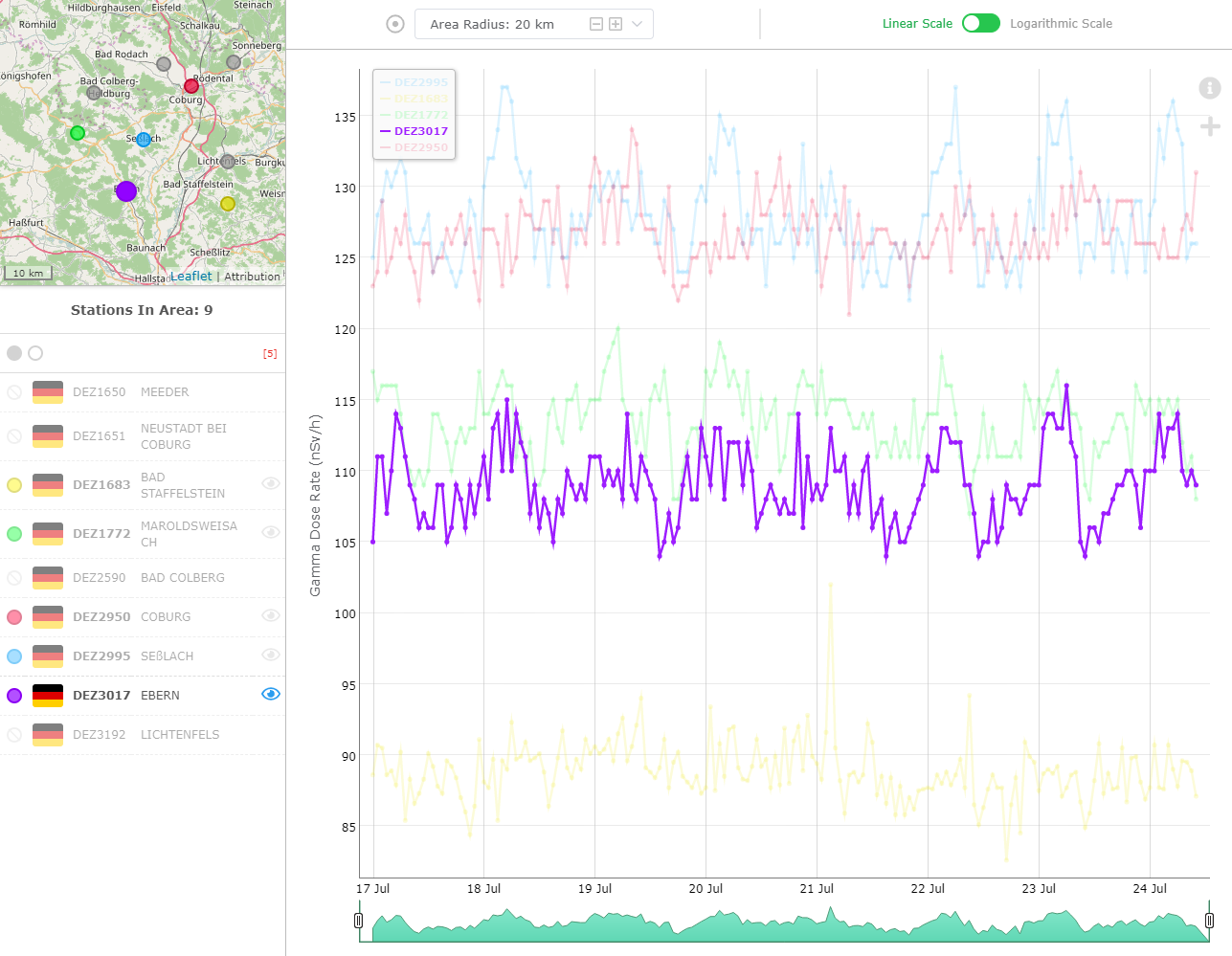 Advanced Map Interactive Time Series Station Focus
Clicking/tapping on the "eye" button again toggles off the focus view and restores the regular presentation on the main graph.
[Top]
Only one station is displayed in the Time Series on smaller screens.
The mini-map, the stations list, and the area radius selector are not available, while the time series graph is expanded to fill most of the window area.
 Advanced Map Interactive Time Series on Smaller Screens
[Top]
Advanced Map Interactive Time Series on Smaller Screens
[Top]
This feature allows to copy an URL that displayes a page reproducing the
same time-series graphics, so you can send it for example by e-mail, the
receiver will be able to open that url allowing to display the same
time-series graphics.
Press the copy url button:

Then, if you send the copied url, the receiver can paste it into a browser
window and view exactly the same time-series. The globe icon
allows to exit to the map home page.
 Advanced Map: time series from copied url
[Top]
Advanced Map: time series from copied url
[Top]
The EURDEP Gamma Dose Rates Adanced Map works in the newest versions of all major Internet browsers, on most devices with a minimum screen resolution of 650px by 650px.
Although touch input is generally supported, some functionality may be restricted to mouse interaction.
The map has been optimised for the following browsers:
| Browser |
Windows |
Mac OS |
| Chrome |
v76+ |
| Firefox |
v68+ |
| Opera |
v63+ |
| Safari |
N/A |
v12+ |
| Microsoft Edge |
v44+ |
N/A |
| Internet Explorer* |
v11+ |
N/A |
* not all functionality available in Internet Explorer, as specified in the sections above